
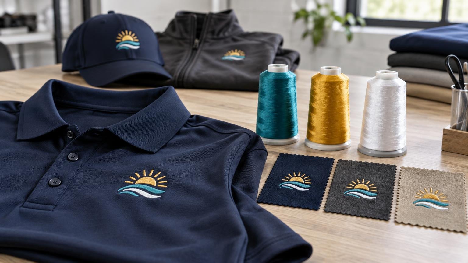
TLDR: Successful embroidery thread color matching company logo work is a controlled translation, not a promise that thread will look identical to a color on a monitor. Start with current vector artwork and brand color references, select thread using a physical color card, and approve a sew-out on the intended garment or comparable material. Record the thread manufacturer, color codes, garment, logo dimensions, placement, and approved art version so future orders can reproduce the same setup.
For uniform buyers, the best match is the one that looks correct on the selected garment and can be repeated. Thread has sheen and texture, while a shirt contributes its own color, surface, stretch, and structure. Those variables mean embroidery thread color matching company logo artwork must be judged as a complete combination rather than as an isolated thread number.
Start with brand files and usable color references
Give the decorator the current master logo rather than copying an image from a website, email signature, or social media profile. A vector file such as an AI, EPS, or suitable PDF generally provides clean shapes that can be interpreted for embroidery. Also provide a brand guide, the intended garment colors, and any approved one-color or simplified versions of the logo.
Pantone references can provide a shared target, but the reference needs context. Pantone identifies PMS as a graphics color system and its FHI and TCX resources as systems for apparel and textile applications. Its overview of Pantone color systems explains these different applications. A company may therefore have a familiar PMS reference for its printed identity without having a corresponding embroidery thread that reproduces it exactly.
RGB, CMYK, and hexadecimal values are still useful for identifying the intended brand color, but they are not machine instructions for embroidery. RGB and hex describe color in digital displays, CMYK relates to process printing, and embroidery machines use selected physical threads. Ask the decorator to document the thread choice made from those references rather than treating a digital value as a guaranteed conversion.
- Current vector logo and its revision date or version name
- Official brand guide and approved color references
- Approved full-color, one-color, and reversed logo variants
- Exact garment manufacturer, style, and color
- Requested placement and approximate finished dimensions
- Any previously approved embroidered sample or thread codes
Why thread looks different from a digital logo
An embroidery supplier chooses from a finite thread palette. Madeira notes that an authorized exact match is not available for every Pantone color because Pantone offers far more colors than its embroidery thread range. The practical decision is often the closest acceptable thread, not a mathematically exact equivalent.
Thread also reflects light. Its apparent color can shift with viewing angle, stitch direction, indoor lighting, daylight, and the contrast created by the garment beneath it. A bright blue may appear more vivid on white and more restrained on navy. Satin stitches can reflect light differently from fill stitches even when both areas use the same spool.
Do not make a critical approval from a monitor or office printout alone. Madeira warns that digital and printed representations may not reproduce thread color precisely, and it offers physical color cards made with actual thread windings for selection. A physical card allows the buyer to hold candidate colors beside the garment under the lighting in which employees will commonly be seen.
Match the logo to the garment construction
The same thread code does not guarantee the same overall appearance on every uniform. Smooth woven shirts and jacket panels provide a relatively even foundation. Pique polos introduce a visible knit texture. Stretch performance knits can move during stitching, while fleece and other lofty surfaces can let small stitches sink into the fabric.
Stabilization helps the embroidery remain controlled. Madeira’s backing guidance says the choice depends on factors including fabric stability, stitch density, design size, material color, and expected laundering. Its guidance distinguishes stable woven materials from unstable or stretchy knits and discusses additional surface support for textured performance fabrics. This is why approving a logo on one polo does not automatically prove that the identical setup will work on fleece or a cap.
Placement and usable space matter too. A manufacturer’s nominal left-chest decoration area may vary in practice with garment size, decoration method, and equipment. Choose the garment and placement before finalizing embroidery dimensions. The guide to company logo placement on work shirts explains how left chest, back, sleeve, and front locations change visibility and proportion.
| Garment surface | Likely concern | Useful approval step |
|---|---|---|
| Smooth woven shirt or jacket | Puckering or excessive stiffness around a dense design | Review stabilization and a sew-out at the intended size |
| Pique polo | Texture can interrupt small details and change perceived color | Sew the logo on the actual polo or matching fabric |
| Stretch performance knit | Fabric movement can distort outlines and registration | Test the complete digitizing, backing, and garment combination |
| Fleece or lofty fabric | Fine stitches can sink into the surface | Review whether topping, stronger outlines, or simplified detail is needed |
| Cap panel | Curved construction and seams can change sequencing and shape | Use a cap-specific production setup and approve the cap result |
If a uniform program includes several garment types, build related production versions rather than forcing one file onto everything. The process in matching logos across polos, T-shirts, hoodies, and jackets helps maintain a consistent identity while allowing dimensions and decoration methods to change.
When a company logo needs an embroidery version
Digitizing converts artwork into machine-readable stitch information. It determines elements such as stitch types, directions, sequence, density, and underlay. Wilcom’s documentation also describes push-pull distortion as an effect caused by the interaction of fabric and thread that may require compensation. Digitizing is therefore a production interpretation of the logo, not simply a file conversion.
Small type, thin lines, tight gaps, gradients, shadows, transparency, and photographic effects deserve special attention. Their suitability depends on the logo’s finished size, stitch plan, thread, fabric, and equipment; there is no responsible universal minimum that applies to every design. A good embroidery version may enlarge lettering, open narrow gaps, strengthen outlines, combine tiny shapes, or replace a gradient with a few solid color regions.
These changes should preserve recognition rather than silently redesigning the brand. Ask to see which details were simplified and compare the result at normal viewing distance. A microscopic detail that exists in the source file but disappears on a shirt is less useful than a deliberate, approved simplification.
Choose thread for the uniform’s use and care
Color is only one part of thread selection. Consider how often the garment will be washed, whether it is exposed to demanding workplace conditions, and whether the organization relies on commercial laundering or particular cleaning products. Ask the decorator to match the thread and backing system to the documented care process for the garment.
For example, Madeira describes its Polyneon polyester embroidery thread as durable and chlorine-resistant and lists workwear among its applications. That is a manufacturer-specific performance statement, not a guarantee for every polyester thread or completed uniform. The whole decorated garment still needs compatible fabric, backing, construction, and care.
Operational consistency matters as much as choosing a durable thread family. If one location orders a generic “royal blue” and another uses an approved manufacturer code, their uniforms may not match. Specify the manufacturer and exact thread code, then retain an approved physical sample when color is important.
Use an approval process that controls color surprises
A screen mockup is useful for checking spelling, logo orientation, dimensions, and placement. It cannot fully show thread sheen, stitch texture, fabric interaction, or stabilization. A sew-out is a stitched production sample that exposes those variables before the full order proceeds.
- Confirm the approved logo version, brand references, garment style, garment color, placement, and finished dimensions.
- Compare candidate threads with a physical thread card beside the garment under more than one relevant lighting condition.
- Review a digital layout for content, orientation, approximate scale, and placement.
- Approve a sew-out using the intended stitch file and production thread.
- For a color-critical or structurally difficult order, request the sew-out on the actual garment or materially comparable fabric.
- Record approval in writing and retain the physical sample when practical.
Review the entire result, not just whether the thread card looked close to the brand swatch. Check lettering, open spaces, borders, color sequence, fabric puckering, coverage, and visual balance. Put the garment on a person or form when placement is important, because a flat table does not reproduce how a logo sits on the body.
Preserve a reorder record
Repeat orders are where informal color matching causes avoidable drift. “Use the blue from last time” is not a production specification. A reorder record should identify both the artwork and the complete garment-decoration setup.
- Approved logo file name, version, and date
- Digitized production file or decorator job reference
- Thread manufacturer, product line, and color code for every logo element
- Garment brand, style number, material, and catalog color name
- Decoration location and finished width or height
- Special backing, topping, or production notes
- Dated mockup, sew-out approval, and photographs of the approved result
- An approved physical garment or sample, when practical
Before a later order, verify that the garment style, color, thread, and production file remain available. If any component changes, treat the replacement as a controlled revision and approve a new sample. This discipline is especially helpful in role-based programs such as embroidered healthcare staff apparel and multi-location operations that need consistent reorders.
When printing may suit the logo better
Embroidery creates a dimensional, durable-looking mark, but it is not automatically the right method for every logo. A printed decoration may be more practical when the identity relies on smooth gradients, photographic imagery, numerous color transitions, very fine detail, or a large lightweight graphic.
The choice should follow the design, garment, order size, and expected use. Performance uniforms may support different options depending on their fabric and construction; the comparison of sublimation and DTF for performance uniforms covers two alternatives. A company can also maintain an approved embroidered logo for polos and jackets while using a related printed version on T-shirts or performance garments.
Common questions about embroidery color matching
Can embroidery exactly match a Pantone color?
Sometimes a thread will be a very close visual match, but an exact authorized equivalent is not available for every Pantone color. Approve the nearest physical thread on the intended garment rather than relying only on a conversion chart.
Why does the same thread look different on two uniforms?
Garment color, texture, lighting, stitch direction, surrounding colors, and the structure of the embroidered design all affect perception. Compare finished samples, not loose thread codes alone.
Can one embroidery file work on polos, jackets, fleece, and caps?
Not reliably in every case. Different fabrics and constructions may require changes to dimensions, sequencing, density, underlay, backing, topping, or distortion compensation. Keep garment-specific versions under one documented logo system.
When is a sew-out worth approving?
A sew-out is especially useful for a new logo, a new garment type, small lettering, close color requirements, textured or stretchy material, or a large order. It is also appropriate whenever a mismatch would be expensive or highly visible.
Build a repeatable embroidered logo standard
Treat company logo embroidery as a specification rather than a one-time visual choice. Supply authoritative artwork, compare real thread against the selected garment, adapt the design to the fabric and finished size, and approve a representative sew-out. Then preserve the thread codes, garment details, dimensions, production reference, and approval record.
That process cannot make thread behave like a glowing screen or guarantee that every fabric will look identical. It can produce something more useful: a brand-approved embroidery result that looks intentional on the uniform and gives future buyers a clear, repeatable starting point.
References
- PANTONE® USA | Pantone Color Systems | Universal Language of Color
- Pantone® Color Match | Embroidery Thread
- Resources | Madeira USA
- www.madeirausa.com
- Embroidery Backing Options Explained
- Slide 1
- Ultimate Guide to Embroidery Backing
- www.madeirausa.com
- Decoration Spec Sheet | SanMar
- SchiffliSupplement.book
- #100-86 MADEIRA POLYNEON 40/60/75