
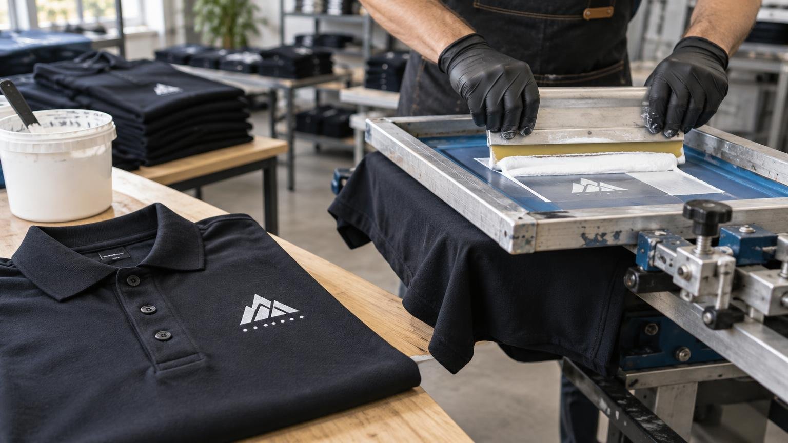
TLDR: A white underbase gives light and bright screen-printing inks an opaque foundation on black, navy, and other dark uniform shirts. It usually improves logo clarity and color consistency, but it also adds ink coverage and production steps. For buyers researching white underbase dark uniform shirts, the practical choice depends on the garment fabric, logo size, required detail, personalization, comfort expectations, and how future replacement orders will be handled.
Picture a staff uniform built around black T-shirts or navy polos with a compact white-and-yellow logo at the left chest. Without the right foundation, the dark fabric can influence the visible colors and make the mark look muted. The answer is often a controlled white underbase, but not every light logo or dark garment needs exactly the same print construction.
What a white underbase does on dark uniform shirts
In screen printing, an underbase is a foundation layer printed beneath the visible design colors. On a dark shirt, a white underbase creates a lighter, more opaque surface so colors such as yellow, light blue, orange, or bright green do not have to compete visually with the garment color. Industry guidance describes the underbase as a way to improve opacity and color appearance on dark textiles. Read the underbase guidance from PRINTING United Alliance.
The underbase normally follows the shapes in the artwork; it is not supposed to be a white rectangle behind the entire logo unless that rectangle is part of the design. Production artwork may use a slight choke, meaning the white foundation is made marginally smaller than the colors above it. That helps prevent a thin white edge from showing if registration varies slightly during printing.
If the finished logo is only white, the production specification may call for opaque white ink rather than a separate white layer hidden beneath another color. The printer could still use more than one application or another production approach to reach the required opacity. Ask for the intended ink construction rather than assuming that every white logo has a distinct underbase and top color.
Why the underbase matters to a uniform program
A uniform logo has to work across more than one freshly produced shirt. It should remain legible on the chosen garment color, look appropriate at the selected placement, and be reproducible when a new employee needs two shirts several months later. The underbase helps control how the visible colors interact with dark fabric, making it an important part of the approved decoration specification rather than an invisible production detail that can be forgotten on reorders.
This matters especially when a brand uses a bright spot color alongside white. A yellow logo printed directly on navy fabric may not resemble the same yellow printed on white fabric. A suitable base gives the visible ink a more neutral foundation. The goal is not maximum ink at any cost; it is enough opacity to produce an acceptable logo while keeping the print suitable for clothing worn through a full shift.
Placement also changes the result. A compact left-chest logo generally involves less printed area than a large solid front or back design, so added ink coverage is less likely to dominate the garment. Before approving artwork, confirm the dimensions and location using a practical work-shirt logo placement guide.
The tradeoff: opacity versus print weight
An underbase adds a printing stage and another layer of ink. That can increase production complexity and affect the feel of a large printed area. The difference may be modest on a small, open logo but more noticeable on a broad design made from solid shapes.
Good artwork can reduce unnecessary coverage. Fine gaps, open lettering, and intentional negative space allow more fabric to remain uncovered. Print construction, ink system, curing requirements, and garment behavior also matter, so “soft” or “heavy” should not be promised from the artwork alone. Ask to approve a production sample when hand feel is important, particularly for lightweight staff shirts worn in warm kitchens, warehouses, gyms, or outdoor settings.
Start with the garment fabric, not the decoration menu
The shirt’s fiber content and construction can change which process is dependable. Cotton and cotton-rich tees are common screen-printing candidates, but that does not mean every blend behaves identically. Polyester and synthetic-heavy performance shirts require greater caution because garment dyes can migrate into printed or heat-applied decoration, changing the appearance of light colors. Fabric-appropriate inks, controlled production settings, and testing may be needed.
DTF transfers also require testing on colored polyester. Roland DGA notes that dye migration can appear after heat application to polyester garments, so a transfer that initially looks white may not necessarily remain visually neutral on every colored fabric. DTG production on dark garments generally uses white ink and pretreatment; Epson also advises using appropriate pretreatment and testing for polyester applications where results can vary.
Do not treat “navy performance polo” as a complete garment specification. Record the manufacturer, style number, exact color name, fiber content, and care instructions. Changing to a similar-looking garment on a later order can change both the apparent logo color and the way the decoration performs.
Screen printing, embroidery, DTF, or DTG?
| Method | Good fit for | Main tradeoff on dark uniforms | Reorder consideration |
|---|---|---|---|
| Screen printing with a white underbase | Coordinated batches using a stable logo and garment | Strong opacity is possible, but larger solid prints gain ink coverage and production steps | Retain separations, ink specifications, garment SKU, placement, and approved proof |
| Embroidery | Compact professional marks on polos, jackets, overshirts, and structured workwear | No printed underbase, but dense stitching and backing can affect drape and wearer comfort | Lock the digitized file, thread colors, dimensions, and placement |
| DTF transfer | Detailed artwork, smaller quantities, names, roles, or frequently changing requirements | Transfer film creates a defined printed area; polyester needs heat and dye-migration testing | Keep the approved transfer size, color reference, application settings, and garment specification |
| DTG printing | Detailed or multicolor artwork where the chosen garment and workflow are compatible | Dark garments require white ink and pretreatment; fabric response can vary | Use the same artwork, garment, pretreatment approach, print settings, and proof standard |
| Sublimation | Purpose-built white or light polyester uniforms with integrated graphics | It does not print white ink and is not a direct solution for a light logo on a dark stock shirt | Best treated as a different garment system rather than a substitute underbase process |
Choose screen printing when the uniform is standardized
Screen printing with a controlled underbase is a strong candidate for a company ordering coordinated black or navy tees with the same light logo, especially when additions will follow the same garment and design specification. It supports repeatable spot-color construction, but the buyer should retain the approved details rather than relying on an old invoice that merely says “logo print.”
Choose embroidery for a compact, textured identity
Embroidery can be a better fit for a small logo on polos, jackets, fleece, and some work shirts when a stitched finish suits the brand. It does not need a printed white foundation, but the garment still requires appropriate stabilization. Madeira explains that backing and stabilization choices influence distortion control, appearance, and wearer comfort, including on lightweight performance fabrics.
Embroidery is less suitable for every design. Very small lettering, gradients, photographic detail, and large solid areas can require simplification or create excessive stitch density. If embroidery is selected, document the approved thread rather than choosing “the closest white” or brand color again on every order. A repeatable thread color-matching process helps keep additions aligned with the original uniform set.
Choose DTF or DTG when detail and flexibility lead the decision
DTF can make sense for small runs, detailed graphics, individual names, changing roles, or programs that cannot justify rebuilding the same screen setup for each variation. The tradeoff is that the transfer has a distinct surface and depends on correct heat application. Test the exact shirt color and fabric before approving a performance-polyester program.
DTG can reproduce detailed artwork without conventional screen separations, but printing on a dark garment still relies on a white-ink and pretreatment workflow. It should not be chosen on the assumption that digital automatically means lighter, softer, or more durable. Those outcomes depend on the garment, artwork coverage, chemistry, settings, and care conditions.
For stock performance apparel, the broader choice often comes down to a placed DTF graphic versus moving to a purpose-built sublimated uniform. This comparison of sublimation and DTF for performance uniforms explains that separate decision in more detail.
Why sublimation does not solve this particular problem
Sublimation is designed around white or light polyester because the process does not print white ink. The garment supplies the white areas in the artwork. It therefore cannot place an opaque white logo over an existing black or navy stock shirt in the way an underbase, transfer, or embroidery can.
A practical recommendation for dark staff uniforms
For a stable white or light logo on coordinated black or navy staff tees, start by evaluating screen printing with an appropriately controlled white underbase. Keep the left-chest artwork compact, avoid unnecessary solid coverage, and confirm that the ink system is compatible with the exact garment. Request a sample when the shirts are polyester-rich, unusually lightweight, expected to receive demanding laundering, or used in conditions where print feel matters.
For polos and outerwear, compare that result with embroidery. For individualized names, changing job titles, or small replacement quantities, compare DTF and DTG workflows rather than forcing every addition through the original bulk method. A uniform program can use more than one decoration method, but the logo should still be managed as a system. The guidance on matching logos across different garment types can help preserve visual consistency without forcing identical dimensions or construction onto every item.
Record these details before the first order ships
The production record is what turns one acceptable order into a manageable uniform program. Retain enough information that a future buyer or supplier can identify what was approved.
- Garment manufacturer, style number, exact color, fiber content, and size range
- Final artwork version and any approved simplifications
- Finished logo dimensions and placement measurements
- Decoration method and whether a white underbase or opaque white construction was used
- Approved visible ink or embroidery thread colors
- A photo or physical sample showing the accepted result
- Proof approval and prior-order reference
- Personalization rules for names, departments, or job roles
- Care instructions supplied with the finished garment
- A substitution policy stating who can approve a different shirt or decoration process
Keep the uniform record focused on apparel production. If the same campaign includes signs, inserts, or other companion pieces, document those commercial printing requirements separately so a shirt substitution or color adjustment does not silently change the specifications for unrelated materials.
Safety-rated apparel needs another level of review. OSHA training material discussing traffic-exposed work highlights high-visibility requirements and 360-degree visibility, so decoration should not be placed on compliant garments without checking whether it affects required visible material or the garment’s intended protection.
Make the foundation part of the specification
A white underbase is not merely an optional brightness upgrade. On many dark uniform shirts, it is the production foundation that allows light logo colors to appear as intended. The right decision is still garment-specific: screen printing may suit a standardized staff order, embroidery may better serve compact polo logos, and DTF or DTG may offer useful flexibility for detail and personalization.
Before ordering, place the exact garment and final logo file side by side. Confirm fabric composition, print dimensions, color expectations, hand feel, care conditions, personalization, and likely reorder pattern. Then approve the decoration construction—including the underbase—along with the visible design. That gives future replacement shirts a much better chance of matching the uniforms already in service.
References
- Underbases — Why, When & How
- Everything You Need to Know to Screen Print an Underbase – ScreenPrinting.com
- Prepare artwork for screen printing
- [Infographic] How to Print Water Based Ink On Athletic Garments – ScreenPrinting.com
- VersaSTUDIO BN-20D – Applying DTF Transfers to Polyester Garments | Roland DGA
- DTG & DTF Printers for Small Businesses | Epson US
- Sports and performance wear | Madeira
- Sublimation Printers for Beginners & Small Business | Epson US
- OCCUPATIONAL SAFETY & HEALTH ADMINISTRATION (OSHA)