
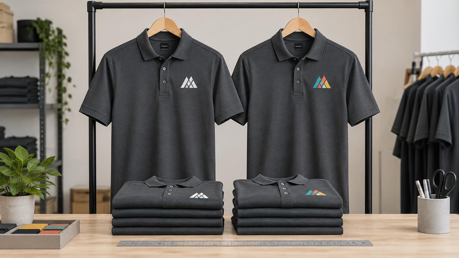
TLDR: Choose a one-color logo when clarity at a small size, broad garment compatibility, and simple brand control matter most. Choose full color when specific colors are essential to recognition and the selected decoration process can reproduce the artwork clearly on the chosen garment. In either case, approve a complete specification covering the artwork version, garment SKU and color, decoration method, logo dimensions, placement measurements, proof, and reorder reference.
The practical question behind one color vs full color logo uniforms is not which artwork looks more impressive on a screen. It is which treatment remains recognizable on an actual polo, T-shirt, fleece, jacket, or hat—and can be reproduced when a new employee needs two more garments six months later.
For many staff programs, the strongest system includes both treatments: an approved one-color mark for compact or operational applications and an approved full-color mark for garments and placements that can support it. That prevents a decorator, manager, or local branch from improvising a new logo treatment for each order.
One-color versus full-color uniforms at a glance
| Decision factor | One-color logo | Full-color logo |
|---|---|---|
| Small-format legibility | Often easier to simplify into a clear silhouette | Works when important details remain distinguishable at the finished size |
| Garment versatility | A dark, light, or reversed version can cover many garment colors | Each garment color and decoration process needs its own visual check |
| Artwork preparation | Requires one approved color treatment rather than an informal conversion | Requires approved color values, separations or production-ready artwork as requested |
| Color control | Focuses on one ink, transfer, or thread target | Requires control of several colors and their relationships |
| Best-fit uses | Small left-chest marks, hats, outerwear, operational workwear | Color-dependent brands, customer-facing apparel, event shirts, larger graphics |
| Approval priority | Contrast, line clarity, negative space, finished dimensions | All one-color checks plus gradients, fine details, color interactions, and garment influence |
These are decision tendencies, not universal production rules. A one-color treatment is not automatically the least expensive, and full color is not automatically less durable. Quantity, garment material, artwork, decoration method, setup, and the supplier’s production workflow all affect the result.
When a one-color logo is the stronger uniform choice
One color is usually the safer starting point for a small left-chest mark. At that scale, recognition depends more on silhouette, spacing, and contrast than on subtle color differences. A compact logo containing several fine lines, a tagline, and color-dependent details may become visually crowded even if the source file is technically sharp.
A one-color system is also useful when the same identity must appear across polos, T-shirts, fleece, jackets, aprons, and hats. Instead of treating every garment as a new design problem, the buyer can approve a dark mark for light garments and a light or reversed mark for dark garments. Both should be official artwork files—not recolored versions created during ordering.
Operational uniforms often benefit from this restraint. Employees may be viewed from a distance, work in varied lighting, or wear an outer layer over their usual shirt. A clear mark with strong contrast can be more useful than preserving every element of a detailed brand graphic.
One color deserves particular consideration when:
- The logo will usually appear in a compact left-chest or sleeve position.
- The mark has a recognizable shape that does not depend on multiple colors.
- The program covers several garment materials and surface textures.
- Dark and light garments both need an approved treatment.
- Fast visual identification matters more than reproducing a complex campaign graphic.
- The buyer wants fewer artwork variants to manage during reorders.
When a full-color logo earns its place
Full color is appropriate when color is integral to the identity rather than an optional flourish. It can also work well on customer-facing shirts, event apparel, or larger back placements where the logo has enough room to retain its details.
Available production routes can include printable vinyl, digital transfers, and dye sublimation; STAHL’S describes sublimation as capable of bright colors, gradients, and all-over applications. The right option still depends on the garment, artwork, location, quantity, and care requirements rather than color count alone. STAHL’S design and placement guidance provides useful starting points for discussing both process and placement with a decorator.
Do not approve a full-color uniform logo solely from a monitor preview. Pantone notes that materials and production variables influence visual color results, and its Fashion, Home + Interiors system includes TCX references intended for soft surfaces such as textiles and apparel. A reference can improve communication, but it does not make different fabrics, threads, inks, and transfer materials look identical. Pantone’s explanation of its color systems helps clarify why the intended target and the produced appearance must be distinguished.
A full-color logo is a good candidate when its essential details survive at the intended finished size, the garment provides suitable contrast, and an approved decorated sample shows an acceptable result. If those conditions are not met, use an authorized simplified mark or move the detailed artwork to a larger location.
Build an approved uniform logo system
Avoid asking each supplier to “make the regular logo work.” Give everyone a controlled set of files with explicit uses. A practical uniform artwork package may contain:
- The primary full-color logo.
- A dark one-color logo for light garments.
- A white or light reversed logo for dark garments.
- An approved small-format mark with tiny text or delicate details removed by the brand owner.
- Horizontal and stacked configurations, if both are officially authorized.
- Vector artwork and any production formats requested by the decorator.
- Written color targets and a record of approved production colors or thread selections.
The small-format mark is especially important. It should be deliberately designed and approved, not created by dropping illegible text from the logo during production. Field uniforms and customer-facing uniforms can use different approved versions as long as the distinction is documented.
Keep uniform specifications separate from other brand materials while maintaining a coordinated identity. If a rollout also requires brochures, signs, or other commercial print pieces, those can be planned through appropriate commercial printing resources rather than forcing an apparel production specification to govern unrelated products.
Select the garment before locking in decoration
Artwork and garment choice have to be approved together. Fabric composition, texture, stretch, seams, plackets, pockets, zippers, lining, insulation, and care instructions can all affect the practical decoration area or the process a supplier recommends.
Even two garments described as performance polos may need separate approvals. For example, SanMar lists the CornerStone CS412 as a 6.6-ounce snag-proof polyester polo with a flat-knit collar, side vents, and adult sizes from XS through 6XL. Its product information also cautions that 100% polyester performance fabrics require special care during screen printing. That is a garment-specific reason to involve the decorator before declaring a process standard.
Before choosing a style, confirm the required size range, garment colors, care needs, employee roles, seasonal layers, and likely availability for future hires. Record the manufacturer, style number, garment color name, and supplier SKU. A description such as “navy performance polo” is not precise enough for a dependable reorder.
If a program spans several garment types, use a coordinated family specification rather than forcing one production recipe onto everything. The logo may share a consistent visual scale while its exact dimensions, placement, and decoration method change by garment. See how to match logos across polos, T-shirts, hoodies, and jackets for a broader garment-family workflow.
Specify logo placement with measurements
“Left chest” identifies a region, not a repeatable production instruction. A useful specification includes the logo’s finished width and height, a vertical measurement, a horizontal alignment reference, and the garment sizes or size groups to which the rule applies.
As starting-point guidance, STAHL’S lists left-chest placement for polos and T-shirts at 7.5 to 9 inches down from the shoulder seam and 4 to 6 inches from center. For jackets, it gives 6 to 8 inches down from the shoulder seam and 3.5 to 4 inches from the center edge. The company notes that placement can require adjustment for garment type and size.
Those ranges are not a universal template. A polo placket, jacket zipper, pocket, women’s cut, youth size, or large size can change what looks centered. Establish a rule for each garment family, inspect representative sizes, and document where the measurement begins and ends.
STAHL’S also lists maximum reference areas of 5 by 5 inches for left chest, 12 by 14 inches for full front or full back, and 3.5 by 3.5 inches for a sleeve. A maximum area is not an automatic recommendation. A left-chest logo occupying the entire 5-inch square could look oversized on many staff garments.
For more help defining reference points, compare the options in this guide to company logo placement on work shirts. The goal is to create a placement instruction that another operator can interpret without relying on memory.
Match logo complexity to its intended location
Evaluate the logo at finished size, not at the enlarged size used during artwork review. Print a paper mockup at actual dimensions or request a digital proof showing the mark on the selected garment. Then check whether the company name, symbols, negative spaces, and any required text remain distinguishable at normal viewing distance.
If a full-color mark becomes muddy at left-chest size, there are three responsible options: use the approved small-format version, enlarge or relocate the logo, or select a different garment and decoration combination. Do not make fine lines heavier, delete text, or change colors without brand approval.
A useful two-location system may put a simplified one-color identity on the left chest and a larger full-color graphic on the back. That arrangement preserves quick identification while giving detailed artwork enough space. It should still be treated as one approved layout, with both locations documented.
Create a repeatable uniform-branding specification
The specification sheet is the operational record that turns a good first order into a reliable program. Create one line item for every approved garment and logo combination. Record:
- Artwork filename, version, and approval date.
- Full-color, dark one-color, light/reversed, or small-format logo designation.
- Manufacturer, garment style number, supplier SKU, and exact garment color.
- Approved size range and any size-specific placement adjustments.
- Decoration method and supplier production reference.
- Finished logo width and height.
- Placement name plus vertical and horizontal measurements.
- Alignment point, such as centerline, placket edge, zipper edge, or shoulder seam.
- Approved ink, transfer, or thread references where applicable.
- Proof number, approval date, and an image or retained decorated sample.
- Order number, reorder identifier, and authorized substitutions.
- Care instructions supplied for the finished garment.
For embroidery programs, keep the approved thread choices with the production record rather than rematching from a screen image during every order. The process in the thread color matching guide for company uniforms can help establish that record.
Treat outerwear, performance garments, and safety apparel separately
A polo approval does not automatically authorize the same treatment on a jacket. Zippers, pockets, linings, insulation, waterproof layers, and seam positions can alter the usable area and production approach. Approve outerwear as its own garment category, even when it carries the same visual logo version.
Performance polyester also warrants a garment-specific review. Ask the decorator to confirm process compatibility, production settings, and care requirements for the selected style. Approval on one polyester shirt should not be treated as proof for every polyester garment.
For high-visibility or other safety-related clothing, decoration decisions must follow the applicable workplace requirements and the limitations of the certified garment. Do not cover visibility materials, labels, or functional areas without confirmation from the responsible safety authority, garment manufacturer, and decorator.
Buyer checklist before approving an order
- Choose the authorized logo version for the role, garment color, and placement.
- Confirm that essential details remain legible at the finished dimensions.
- Approve the exact manufacturer, style, color, SKU, and size range.
- Ask the decorator to confirm that the method suits the garment and artwork.
- Record width, height, vertical position, horizontal position, and alignment reference.
- Review a proof showing the selected artwork on the selected garment.
- Approve a decorated sample when color, fine detail, fabric behavior, or a new process creates material uncertainty.
- Store the proof, sample record, production identifiers, and order number together.
- Require written approval before substituting a garment, color, process, or artwork version.
Common questions about one-color and full-color logos
Is one color or full color better for staff uniforms?
Neither is universally better. One color is often the practical choice for compact marks and programs spanning many garments. Full color is appropriate when brand recognition depends on specific colors and the finished sample remains clear. Many organizations should approve both versions for defined uses.
Can a full-color logo work on the left chest of a polo?
Yes, if the logo remains legible at the intended size and the selected garment and decoration process reproduce it acceptably. Approve the actual combination rather than assuming that a detailed digital file will translate perfectly.
Should placement be identical on polos and jackets?
Not necessarily. The placements should look intentionally coordinated, but construction differences can require separate measurements. Specify each garment family instead of copying one measurement across every product.
How can repeat orders stay consistent?
Reorder from a controlled specification containing the artwork version, garment SKU and color, decoration method, logo dimensions, placement references, production colors, proof, decorated sample record, and previous order identifier. Review and authorize substitutions before production.
Choose a system, not just a logo treatment
For most uniform programs, the best answer is not an exclusive commitment to one color or full color. It is a controlled logo system: one-color versions for compact, versatile applications and a full-color version for placements that can support its detail and brand value.
Start with the actual garments and roles. Approve the logo at finished size, measure placement from named reference points, and save the production record. That work may feel more procedural than choosing the best-looking mockup, but it is what keeps a uniform program consistent across employees, seasons, and reorders.