
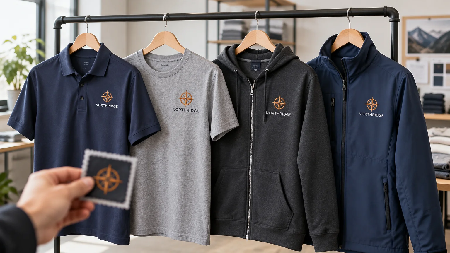
TLDR: To match logo placement across employee apparel, keep the brand elements consistent but create garment-specific rules for size, position, and decoration. Use the same approved artwork, color references, and placement hierarchy across the program, then document separate production specifications for each garment style. Approve physical samples before rollout and retain the artwork files, garment identifiers, measurements, decoration settings, and sample records for reorders.
A logo does not need to have exactly the same physical dimensions on every shirt or jacket to look consistent. The better way to match logo placement across employee apparel is to create one recognizable visual system that accounts for plackets, zippers, pockets, seams, hoods, fabric behavior, and available decoration space. A compact left-chest logo may suit a polo, while the same artwork needs a slightly different scale or position on a bulky jacket.
Build one logo system, not one universal measurement
Consistency comes from repeating the decisions people notice: the same logo version, recognizable color treatment, similar visual prominence, and a predictable placement hierarchy. It does not come from telling a decorator to make every logo the same width and place it the same distance below the collar.
Manufacturer decoration guides are style-specific because usable space changes with garment construction, size, decoration process, and equipment. Selected SanMar specification sheets, for example, show 4-by-4-inch left-chest areas on certain polo and jacket styles, while chest and back areas on other garments can be substantially different. Those figures describe particular styles rather than a rule for all apparel.
Use the actual garment’s current decoration specification and a physical sample as the starting point. If you are still deciding where each mark belongs, this guide to company logo placement on work shirts explains the practical roles of chest, back, sleeve, and front locations.
Separate brand constants from garment-specific variables
Your uniform standard should distinguish decisions that remain fixed from decisions that must adapt. This prevents accidental brand changes while giving the decorator enough flexibility to produce a clean result on different fabrics and garment shapes.
| Keep consistent across the program | Define separately for each garment |
|---|---|
| Approved logo version and proportions | Finished logo width and height |
| Rules for full-color, one-color, and reversed artwork | Exact placement from repeatable garment landmarks |
| Brand color references | Decoration method and material |
| Minimum acceptable detail and legibility | Thread, ink, film, or transfer color selection |
| Primary and secondary placement hierarchy | Backing, underbase, digitizing, or production settings |
| Rules for employee names or departments | Approved garment brand, style number, color, and size range |
Lock the master artwork before discussing placement. Identify the approved horizontal, stacked, simplified, and one-color versions, if those variants exist. Do not let each garment order become an opportunity to redraw small lettering, remove a symbol, or alter spacing merely to fit an inconvenient location. If the complete logo is too detailed for a small sleeve or chest area, use an approved simplified mark rather than an improvised edit.
Create a placement hierarchy
A placement hierarchy tells buyers and decorators which location should carry the primary identity and when secondary marks are allowed. A practical employee-apparel system might use the following order:
- Primary left chest: the default for polos, button-front work shirts, fleece, and jackets when seams, pockets, and closures allow it.
- Right chest: reserved for an employee name, department, certification, or another clearly defined identifier.
- Upper back: used when the company must be recognizable from behind without turning the garment into a full promotional graphic.
- Sleeve: reserved for a short secondary mark that remains legible within the available area.
- Full chest or full back: used intentionally for T-shirts, sweatshirts, event apparel, or roles requiring greater visibility.
PPAI advises evaluating the garment, fabric, logo detail, location, and order quantity when choosing a decoration method. Its apparel guidance also notes that sleeves, cuffs, collars, nape areas, and lower-front positions can have access or minimum-size constraints. Review the PPAI apparel decorating guidelines when considering an unconventional location.
Avoid assigning two primary locations without a reason. A large front logo, large back logo, and sleeve mark can make a staff uniform feel visually crowded. Start with one primary mark, then add only the identification or visibility elements needed for the employee’s role.
Apply the system garment by garment
| Garment | Recommended starting approach | Construction details to check |
|---|---|---|
| Polo | Compact left-chest mark, scaled to the available field | Placket, collar, pocket, chest shaping, stretch, fabric weight, and button position |
| T-shirt | Left chest for staff identification or full chest for stronger visibility | Neck rib, side seams, fabric weight, print area, and size-to-size proportions |
| Pullover hoodie | Left chest or centered front only when the pocket and drawcords leave a clean field; upper back is another option | Kangaroo pocket, hood overlap, drawcords, thick seams, and fleece texture |
| Zip hoodie | Place the logo on one chest side or use a back location | Center zipper, pocket openings, hood, ribbing, and panel width |
| Jacket | Use a chest or upper-back location approved for the exact style | Zippers, storm flaps, pockets, insulation, lining access, waterproof layers, and panel seams |
For polos, alignment should respond to the placket and the available chest panel rather than an assumed distance from the collar. Measure from landmarks that can be found again on the same style, such as a placket edge and a documented seam or panel boundary. Record both the horizontal and vertical position on the approved size.
T-shirts usually provide a larger uninterrupted area, but that does not mean the polo logo should automatically be enlarged. Decide whether the tee is intended to look like staff apparel or promotional apparel. A modest left-chest mark supports continuity with polos; a full-chest graphic creates a deliberately different, more visible presentation.
Hoodies and jackets require the most construction awareness. A centered design can collide with a zipper, drawcords, or kangaroo pocket. A chest mark may need adjustment around a pocket opening or shaped panel. On insulated or lined jackets, the decorator must also determine whether the location can be accessed and decorated without compromising the garment’s construction.
Choose the process for the garment, not for forced uniformity
The same brand system can use embroidery on polos and jackets, a printed or transferred mark on T-shirts, and another suitable process on performance apparel. Viewers primarily notice whether the logo is recognizable, positioned intentionally, and reasonably consistent in color and scale. They do not require every garment to use the same production process.
Embroidery often gives chest marks a structured appearance, but stitch count, density, backing, and fabric stability affect the result. Printed and transfer methods can preserve fine details or small lettering that would become heavy or indistinct in thread. PPAI identifies digital transfers as an option for lightweight golf shirts with detailed logos, direct-to-garment printing as one option for small multicolor runs of tees and sweatshirts, and sublimation for colorful graphics on compatible polyester performance apparel.
For stock performance garments, the choice between transfer methods can also depend on fabric, artwork coverage, and the ordering model. Our comparison of sublimation and DTF for performance uniforms explains why purpose-built sublimated uniforms and placed transfers solve different program needs.
Do not assume one embroidery file fits every garment
An embroidery file prepared for stable pique may not sew equally well on thin stretch fabric, lofty fleece, or a layered jacket. Madeira’s performance-wear guidance says slippery, sheer, and stretch fabrics need particular care. It recommends avoiding excessive stretching during hooping and considering lighter, less stitch-dense designs with suitable low-profile stabilizers.
Ask the decorator whether a garment-specific digitized version, backing choice, underlay, density adjustment, or size change is needed. Keep these production files under the same approved logo identity, but label them clearly by application. A filename such as “logo-left-chest-pique” is more useful for reordering than a folder containing several unexplained files called “final.”
Standardize color without promising an impossible exact match
Give the decorator the approved brand color references, original vector artwork, and rules for one-color and reversed applications. Pantone explains that color appearance can vary with material and production method, and that suppliers and production runs can introduce variation. A Pantone reference improves communication, but it cannot by itself make embroidery thread, screen-printing ink, transfer film, and dyed fabric appear identical.
Aim for a coordinated visual match under the lighting where employees will normally wear the garments. Approve the actual thread and printed color against each garment color. Dark fabric may require a light or reversed logo; a heathered shirt may alter perceived contrast; and glossy thread can reflect light differently from a matte print.
Record the supplier’s thread, ink, or material identifier as well as the brand reference. On reorders, request the recorded production color instead of asking a new operator to interpret the brand color from a screen image.
Approve representative samples before the full rollout
A digital proof can verify artwork selection, spelling, approximate scale, and intended location. It cannot fully show how fabric stretches, how embroidery affects drape, whether a hood hides an upper-back mark, or whether a chest logo looks balanced when the garment is worn.
Approve a representative physical set that covers the program’s meaningful differences. PPAI’s corporate-apparel guidance recommends using a specification sample so the buyer can evaluate the program before a broad rollout. A sensible sample set might include the smallest and largest expected logo applications, the lightest performance fabric, a fleece garment, and the most structurally complicated jacket.
Check each sample on a person or correctly sized form. Look at normal standing distance, not only from a few inches away. Confirm that the logo is level, readable, clear of closures and pockets, and visually balanced across the expected size range. If one placement cannot scale acceptably from the smallest to largest sizes, define separate size groups rather than accepting a visibly misplaced mark.
What belongs on the logo placement spec sheet
The approved sample is the visual standard; the written specification makes it repeatable. Create one record for every garment and decoration combination.
- Garment manufacturer, style number, garment color, and approved size range
- Artwork filename, revision date, logo version, and production-ready file
- Finished decoration width and height
- Placement name, such as left chest or upper back
- Horizontal and vertical measurements from named, repeatable garment landmarks
- A photograph of the approved placement with a ruler or measurement overlay
- Decoration process and production file identifier
- Thread, ink, transfer, or other material color codes
- Backing, underbase, digitizing, or other process notes supplied by the decorator
- Rules for employee names, departments, credentials, or variable data
- Proof approval date, physical sample approval date, and approving person
- Original order number, supplier, decorator, and reorder contact information
- Approved physical sample location and retention period
- Any size-group or garment-specific exceptions
Photograph the approved sample flat and worn, and retain an undecorated garment if future availability and storage allow. When a style is discontinued, do not simply move its measurements to the replacement. Compare the new garment’s chest panels, seams, closures, fabric, and current decoration specifications, then approve a replacement sample.
The practical next step
Begin with one representative polo, T-shirt, hoodie, and jacket. Lock the artwork and placement hierarchy, obtain the current garment specifications, and create a separate measurable recipe for each style. Then approve physical samples before placing the broad order.
The result should look intentionally related rather than mechanically identical. Keep the logo identity, color strategy, and hierarchy constant; adapt size, position, decoration process, and production settings to the garment. That approach produces a more coherent employee uniform program and gives future buyers enough information to reproduce it.
References
- Decoration Spec Sheet | SanMar
- Decoration Spec Sheet | SanMar
- Apparel Decorating Guidelines – PPAI – Promotional Products Association International
- Using Performance Backing for Performance Wear Garments
- Performance Stabilizers
- PANTONE® USA | Pantone Color Systems | Universal Language of Color
- 7 Steps To Create A Successful Corporate Apparel Program – PPAI – Promotional Products Association International